
Color Adjustment Performed on Digital Cameras

Advanced Function for Direct Printing from Your Camera
PictBridge-compatible Canon digital cameras have an advanced function that allows you to set print effects.
![]() Note
Note
Settings are available only when a Canon digital camera supporting the advanced function is connected to a Canon PRO series inkjet printer.
Color Mode Setting
There are five color modes for image optimization (PrintEffect): Natural, Natural M, B/W, Cool tone and Warm tone.
See the manual of your PictBridge-compatible Canon device for details on the setting procedure.
Natural
Prints in color tones close to those of the photos shot with a digital camera.
When a setting such as "Picture Style" is set, its effect will be reflected in the print results.
Natural M
Prints after adjusting the color tones (brightness, contrast, etc.) of photos shot with a digital camera.
B/W
Produces a black and white photo with a tone that looks like an achromatic color.
Cool tone
Produces a black and white photo with a cool bluish color tone.
Warm tone
Produces a black and white photo with a warm yellowish color tone.
Adjusting Colors before Printing
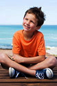
Select Natural M in image optimization (PrintEffect) to print in the specified color.
Setting "Brightness" and "Adjust levels"
You can set "Brightness," "Adjust levels" and "Red-eye corr. (Red-eye correction)" for printing.
Brightness Correction
You can adjust the overall image brightness by increasing or reducing the midtone brightness, without changing the colors of the darkest (blackest) and brightest (whitest) areas.
Even for a photo of "blue sky and shadows," you can make the shadowy areas clearer by "brightening" the photo.
| Brightest (whitest) area | |||||
 |
|||||
 |
 |
 |
|||
 |
Brighten | Standard | Darken | ||
| Darkest (blackest) area | |||||
 |
 |
 |
|||
Level Adjustment
By detecting the darkest (blackest) and brightest (whitest) areas automatically or by specifying them, you can print images suitable for the midtone brightness.
Exposure can be corrected even if set incorrectly when shooting an image.
Auto
Detects the darkest (blackest) and brightest (whitest) areas of an image by analyzing it, then adjusts to the appropriate level.
Manual
Specify the darkest (blackest) and brightest (whitest) areas and adjust to the desired level.
Red-eye Correction
Corrects red eyes caused by a camera flash.
Setting "Contrast," "Saturation," "Color tone" and "Color balance"
You can set "Contrast," "Saturation," "Color tone" and "Color balance" in Detail set. in Natural M.
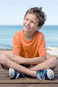
Contrast Adjustment
You can adjust the overall image sharpness by increasing or reducing the contrast of the midtone brightness, without changing the colors of the darkest (blackest) and brightest (whitest) areas.
You can improve images lacking sharpness by "emphasizing" the contrast to turn them into sharp images.
| Brightest (whitest) area | |||||
|
|||||
 |
 |
 |
|||
|
Reduce | Standard | Emphasize | ||
| Darkest (blackest) area | |||||
 |
|
 |
|||
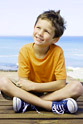
Saturation Adjustment
You can adjust the overall image vividness by increasing or reducing saturation, without changing the colors of the darkest (blackest) area, gray axis and brightest (whitest) area.
Emphasize
Makes colors of flowers, etc. more vivid.
Reduce
Reduces redness of skin, etc.
Color Tone Adjustment
You can adjust the overall image color tone by rotating the hue, without changing the colors of the darkest (blackest) area, gray axis and brightest (whitest) area.
+ (+ adjustment)
Makes skin tones yellower.
- (- adjustment)
Makes skin tones redder.
 |
|
 |
|||
| + | Standard | - |
Color Balance Adjustment
You can adjust the overall image colors by shifting midtone colors, without changing the colors of the darkest (blackest) and brightest (whitest) areas.
You can reduce the blueness of bluish images, such as a shadowy area under blue sky, by adjusting the color to be yellower or redder.
When the colors of shot images are different from human memory colors (pure white of wedding dresses, red of tomatoes, etc.), you can adapt those colors to be closer to memory colors.
 |
|||||
| G (green) direction | |||||
 |
|
 |
|||
| B (blue) direction | Standard | A (amber) direction | |||
 |
|||||
| M (magenta) direction | |||||

