
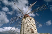
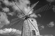
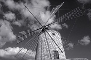
Being Particular about Color Tones of Black and White Photos

To transform a black and white photo into a high quality work of art, perfect the color by adjusting it to how you want the work to look, and by considering how you want it to be seen.
 |
 |
Point for Development/Correction: "Adjust Brightness"
Convert color photos to black and white using image editing software. Since black and white photos lack color, the impression of the work of art changes with brightness. Correct brightness to make it closer to what you want.
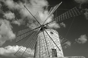
Point for Printing 1 "Determine the Color Tone"
Even black and white photos have various color tones. Color tone adjustment according to how you want the work of art to look is as an important factor as it is for color photos. When performing black and white printing in Print Studio Pro, you can select from the following three color tones.
| Cool Tone | Neutral Tone | Warm Tone |
|---|---|---|
| A cool bluish color tone; effective when you want to give a stylish, sharp impression |
A color tone that looks like an achromatic color | A warm yellowish color tone; effective when you want to convey a subtle sense of familiarity |
 |
|
 |
Point for Printing 2 "Perfect the Color"
Make the color tone of the work of art closer to what you want. In Print Studio Pro, you can create subtle colors since fine adjustments are possible aside from color tone selection. By additionally using the Pattern Print function, you can perform accurate color adjustment while checking the print result.
See "Color Adjustment in Black and White Printing" for details on color adjustment.
Point for Printing 3 "Color Adjustment According to Paper"
When you perform color adjustment according to the paper to be used, the work of art will be more delightful.
- Photo Paper Plus Semi-gloss
- Fine Art Paper "Museum Etching"
One of the points to remember is to adjust colors so that the gradation is represented properly.
There is also a technique to adjust the color so that the texture of paper shows through by deliberately creating blocked-up shadows in part of the photo.

