
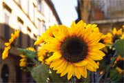
Printing Flowers in Vivid Colors
It is desirable that photos of beautiful flowers convey natural vivid colors to their viewers. This will provide a three-dimensional feel with the flowers while bringing out vividness of their colors by utilizing the printer's color space.
Point for Shooting: "Shoot Clear, Non-blurry Photos"
Be careful with camera shake when shooting close-ups. If the printed image looks unclear, check that the photo is not blurry.
Point for Development/Correction 1: "Use the Adobe RGB Color Space"
You can utilize the printer's color space since the Adobe RGB is a wider color space than sRGB.
By shooting in RAW format, you can select a color space when developing/correcting. When changing the color space, remember to change the image editing software's working color space.
When shooting in JPEG format, set the camera's color space to Adobe RGB beforehand.
See "About Color Spaces" for details on color spaces.
Point for Development/Correction 2: "Avoid Increasing Contrast and Sharpness Too Much"
Gradation is important for macro photos (close-up photos). When you correct contrast or sharpness, be careful not to lose the smooth gradation by increasing it too much.
Point for Printing 1: "Print Using ICC Profiles"
By specifying an ICC profile in Print Studio Pro, you can fully utilize the printer's color space.
See "Printing Using ICC Profiles" for printing using ICC profiles.
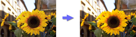
Point for Printing 2: "Select Glossy Paper"
Select glossy paper when you want to represent vivid color tones.
 |
 |
| When printed on glossy paper | When printed on matte paper |
![]() Tip
Tip
Matte paper is suitable for soft photos.
See "Media Types" for details on media types.


